Hair-raising data on checks.

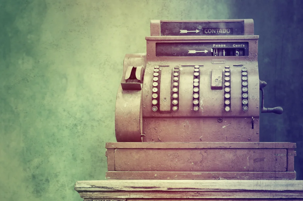
Like everyone else in our industry, I have known that check usage for business-to-business (B2B) payments has remained high, but a recent report published by PayStream Advisors goes a step further to help explain why. As a contributing analyst to the report, I was surprised to discover that survey respondents perceive checks as best in four of 10 attributes, compared to other payment methods. For example, 55% rated checks as the option offering the “most complete remittance information.” As the report notes, favorable views of checks influence payment strategy. 

The Prevalence of Checks

Last year, the AP Automation Study by the Institute of Financial Operations (IFO) revealed 52% of survey respondents use checks for at least half of their B2B payments and 32% use checks for at least 75%. The PayStream survey results are even higher:

The report observes, “Although heavy check users are more challenged by high payment processing costs than the other organizations, they are also less likely to change their payment management strategies; the majority of heavy check users have not taken actions to decrease checks and increase electronic payments in the last two years.” Among heavy check users, 40% have taken actions to decrease checks (they are obviously falling short) compared to 81% of the remaining organizations. Indeed, concerted efforts are necessary to reduce checks, including implementing (and enforcing!) specific payment policies, and educating internal staff and suppliers about the benefits of electronic payments. 

Obtain the PayStream Report

The PayStream Advisors’ report, Electronic Payments and Card Solutions in 2015: Perceptions, Realities and Strategies, features:

  • trends in B2B payment method usage 
  • the status of Commercial Cards
  • influential factors for payment strategies
  • a look into payment solution providers

The report is available from PayStream Advisors.

Where Does Your Organization Stand?

Is your organization among the heavy check users? My January 5, 2015, blog post on reappraising the value of card payments included three key questions for organizations to address about their B2B payment strategies.

  1. What will drive your organization to reduce its check volume by adopting more card payments? 
  2. What percentage of B2B payments do checks comprise? 
  3. What is your card payments opportunity?

As you seek increased buy-in for expanded card usage, it can help to first understand what is behind any resistance. Many factors influence people’s perceptions about Commercial Card programs: previous experiences, lack of knowledge, media reports, and resistance to/fear of change. To combat misperceptions, the best approach is to avoid emotional arguments and stick to the facts. 

Face your payment strategy pitfalls head on and embark on some clean up. 

Face your payment strategy pitfalls head on and embark on some clean up. 


Available Education

For those interested in a broad introduction of Purchasing Cards and electronic payables, both of which are key ways to diversify a payments strategy, consider the on-demand course I created for Proformative Academy, an online professional development platform for CFOs and similar. 


About the Author

Blog post author Lynn Larson, CPCP, is the founder of Recharged Education. With more than 15 years of Commercial Card experience, her mission is to make industry education readily accessible to all. Learn more

Subscribe to the Blog

Subscribe

Are we ready for chip cards?

The October 1 liability shift in the United States is less than two months away. Are merchants equipped to handle chip/EMV cards? According to an article published by TheStreet, 47% of all merchant terminals will be able to read chip cards by the end of 2015. Further, are cardholders and merchant clerks prepared by understanding how to use the cards? Through my own informal study, I would say no for the most part.

Cardholder Confusion

As Commercial Card professionals, we have a head start on being familiar with chip cards, but, if you question your friends and family on this topic, you might get blank stares. This has been my experience.

TheStreet article reported that, by the end of 2015, 63% of credit and debit cards will be chip enabled. When I received my new business credit card with a chip, an accompanying brochure explained how to use it. I wonder how many cardholders will bother to read such material. Either way, I think my brochure is unclear. For example, it says I can still swipe my card at merchant locations with magnetic stripe point-of-sale (POS) devices. Hmmm... Since basically all U.S. merchant terminals will still have magnetic stripe readers, it sounds like I can ignore the chip altogether. Not so fast. Chip-enabled devices could generate an error message if a cardholder tries to use the mag stripe.    

An article by Computerworld noted a consumer might give up using a chip card because the process takes at least a couple seconds longer than the “old way.” The article also described how the payment confirmation will vary by terminal type or store, which could cause confusion.   


Links to Referenced Articles 

See also more EMV content on this website.

Merchant Confusion

When out shopping, I have been randomly asking store clerks if they are seeing many chip cards. One replied, “Do you mean a card that they wave over the machine?” Well, maybe—if the terminal supports near-field communication (NFC) technology—but when I pointed out the chip card slot on the POS device, she admitted she had not noticed that before. At a different store, a clerk said he did not know whether “that slot” worked.

Generally speaking, clerk training seems to be lacking. Pair untrained clerks with unaware cardholders and we get significant potential for checkout hiccups until everyone adjusts. 

While POS equipment no longer looks like this, many U.S. merchants will not have chip-ready devices by year end.

While POS equipment no longer looks like this, many U.S. merchants will not have chip-ready devices by year end.

What You Can Do

Per my advice in the January blog post on the different EMV options, if you are an end-user organization, ensure you understand your type of chip card, requirements for usage, what could go wrong and how to resolve any issues. For cardholders who make in-person purchases, train them accordingly.

Visit GoChipCard.com

You do not need to create training from scratch. The EMV Migration Forum and the Payments Security Task Force developed GoChipCard.com to assist consumers, merchants and issuers with the migration to chip technology.


About the Author

Blog post author Lynn Larson, CPCP, is the founder of Recharged Education. With more than 15 years of Commercial Card experience, her mission is to make industry education readily accessible to all. Learn more

Subscribe to the Blog

Subscribe

How to present numbers with flair.

Delivering a presentation filled with numbers/statistics creates an added challenge for any presenter. For expert advice, Recharged Education invited Michael Campbell, Radiate Presentation Design, to offer tips. Before stepping in front of another audience, whether it is your management or industry peers, ensure your presentation meets Michael’s “three Bs” of presenting numbers. 


The Three Bs of Presenting Numbers

by Michael Campbell, Radiate Presentation Design

In the time it takes you to read this sentence, millions of presentations have begun in boardrooms, conference rooms and coffee shops around the world. And while I don’t have an exact figure, we can assume these presentations feature a goodly share of numbers—lots of numbers. As vital symbols for storytelling, numbers quantify progress and failure. They offer a sense of scope and scale. They add, subtract, multiply and divide our understanding of a situation. Unfortunately, a vast percentage of these numbers are unreadable, under-utilized and under-valued in presentations.

“You probably can’t read this in the back row.”

We’ve all been in the back row for these presentations. Heck, even the folks in the front row are squinting as the speaker clicks through spreadsheets and screen shots with tiny numbers. How do we stop the madness? How do we give numbers their due? It’s simple, really. When building presentations, we need to be mindful of the three "Bs" of presenting numbers: make them Big, Bold and Beautiful.

Big Numbers

Wizards are one of the biggest problems in presentations today. Not the white-bearded fellows who take you on quests for dragon’s gold. I’m talking about the step-by-step, "hand-holding" assistants in programs like Microsoft Excel and PowerPoint. Wizards promise "beautiful charts and graphs" in minutes—no design experience necessary—just turn the crank and Voila! Unfortunately, most people don’t look back after they’ve clicked "Create Chart.” The result is usually a pie or bar chart with a Day-Glo palette and tiny numbers in Arial Bold. Few presenters stop to consider the readability of these "insta-charts" for their audience—especially the poor folks in the back row who are destined to receive an apology from the speaker for the “eye-chart.”

If you are using a wizard, take another moment to review and reflect on the readability of the chart or graph. Step back eight feet from your monitor. Can you read it? Think about your audience. Can they read it? Guess what? You’re more powerful than a wizard. You can override their wizarding results. Double-click the numbers and double their size from 12 point to 24 point. Change the colors—double-click and darken pie slices for greater contrast. It only takes a few minutes and a few extra steps to ensure your audience gets the true impact of the numbers.

Figure 1 - The pie chart on the left is directly from the PowerPoint chart wizard. The pie chart on the right shows what five minutes of editing can do to improve readability. 

Figure 1 - The pie chart on the left is directly from the PowerPoint chart wizard. The pie chart on the right shows what five minutes of editing can do to improve readability. 

Bold Numbers

A no-brainer, you say? Just click the "B" on the formatting toolbar and "BAM!" your numbers are bold. Yes, formatting numbers with bold helps readability; however, let’s consider another definition of boldness. I’m talking about Mick Jagger boldness. As the front man of one of the biggest arena acts of the late 20th and early 21st centuries, Jagger uses his voice and body language to entertain his fans—even in the upper deck—with no apologies. So why are so many presenters hiding their numbers in text-heavy bullets? Let your numbers stand out. Give them the spotlight. Give them the microphone. Let them rock the audience.

What’s bolder than a giant set of digits in the middle of a slide? BAM! Now, that’s bold! A celebratory number shouting: we met our goal. A big, bad number representing an obstacle to overcome. A giant target number you want to burn into the memories of your team.

As you review your slides, consider the importance of each number. Find opportunities for boldness. Look for the numbers deserving the spotlight.

Figure 2 – The Rolling Stones wouldn’t get any satisfaction with the top slide—their achievements are buried in the bullets. The slide on the bottom pulls out the big numbers and helps the audience visually grasp their achievements.

Figure 2 – The Rolling Stones wouldn’t get any satisfaction with the top slide—their achievements are buried in the bullets. The slide on the bottom pulls out the big numbers and helps the audience visually grasp their achievements.

Beautiful Numbers

Are you ready for some brain science? When the human brain detects a presentation with the fonts Arial or Calibri, the visual cortex flips an internal switch, sending the brain into a mild state of catatonia. Okay, I made that up. There is, however, some truth to the stimulating effect of beauty on the human brain. What does this all mean for our numeric heroes? There is a big wide world of typography to explore and plenty of free fonts to download and try (check out www.fontsquirrel.com for starters). Don’t stick with the default fonts. Go forth and find a font to enhance the readability and aesthetics of your charts, graphs and tables.

Wait! Hold on—not so fast. Here are some parting words of advice on this subject:

  1. Avoid cursive or script fonts. While beautiful, most often they are not appropriate for displaying numbers.
  2. Take a look at fonts like Bebas Neue and Passion One (both available on Font Squirrel).
  3. Don’t beautify fonts with drop shadows, 3D effects or anything listed under a menu called “Type Effects.”
  4. Look around. Take note of the use of typography in the world around you. I’ve found inspiration in breakfast cereal boxes, ESPN motion graphics, infographics and billboards. Pinterest is a great resource for ideas.
Figure 3 – Default fonts like Calibri and Arial (top row) are serviceable as readable text, but there can be beauty in numbers. The beautiful fonts above in the lower half of the figure (second row l-r): Bebas Neue, Passion One, Montserrat (third ro…

Figure 3 Default fonts like Calibri and Arial (top row) are serviceable as readable text, but there can be beauty in numbers. The beautiful fonts above in the lower half of the figure (second row l-r): Bebas Neue, Passion One, Montserrat (third row l-r): Brooklyn Samuels, Recovery.


About the Guest Blogger

Michael Campbell is a Presentation Strategist and Creative Director at Radiate Presentation Design in Minneapolis, Minnesota. Radiate helps clients like Cargill, Land O’Lakes, Hewlett-Packard and Medtronic connect with their audiences using memorable content and visual storytelling. Campbell has a passion for making his clients’ voices heard, their messages understood, and their visions realized. You can view project samples and read more about Radiate at www.radiatepresents.com.

Subscribe to the Blog

Subscribe